하우스 위드 케이 - housewithk
PHILOSOPHY
enter craft Room
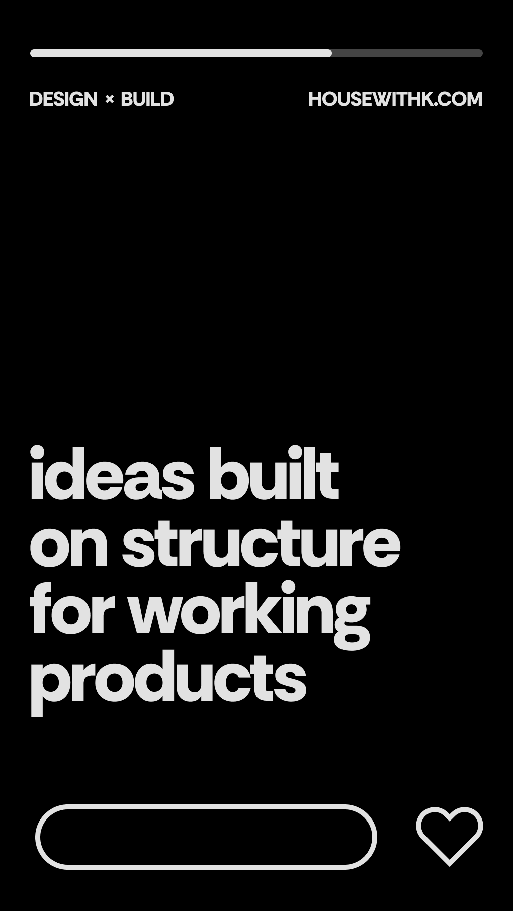
Ideas are finalized through structure
PHILOSOPHY
enter craft Room
Ideas are finalized through structure
BASIC
TOOLS
Figma
Figma
Affinity
Designer
Affinity
Designer
Affinity
Photo
Affinity
Photo
2026
Visual Identity
Branding
Logo Design
HOUSE WITH K
HOUSE WITH K
A brand that designs systems across online and offline, from branding to web/app design and Framer implementation. Through 'CRAFT ROOM' for precise logic and 'VISION ROOM' for tangible experience, I define the brand's direction and explore new possibilities by focusing on structural essence.
A brand that designs systems across online and offline, from branding to web/app design and Framer implementation. Through 'CRAFT ROOM' for precise logic and 'VISION ROOM' for tangible experience,
I define the brand's direction and explore new possibilities by focusing on structural essence.
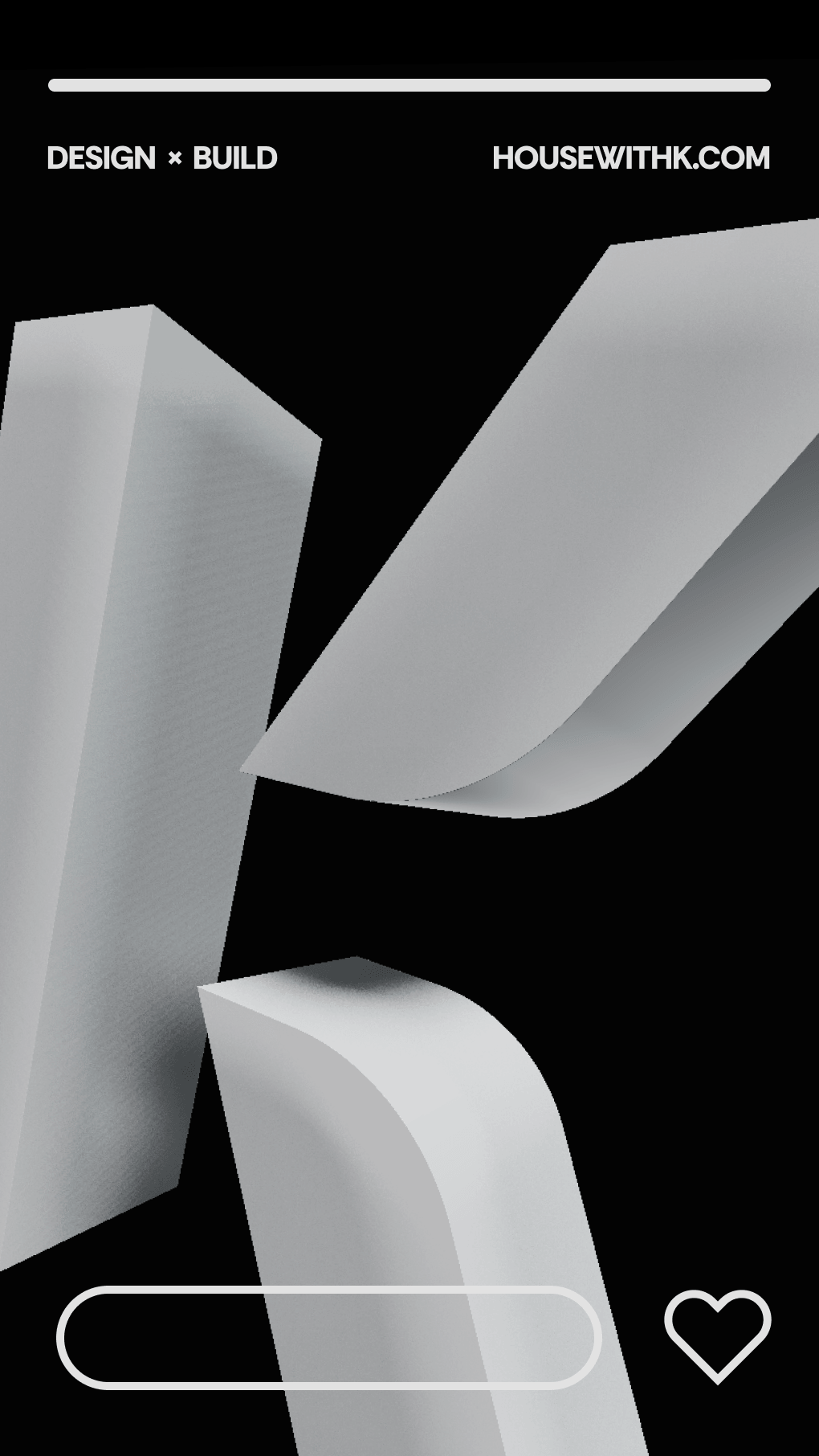
PHILOSOPHY
ENTER CRAFT ROOM
ENTER CRAFT ROOM
아이디어는 구조가 될 때 완성됩니다.
Ideas are finalized through structure
BEYOND
THE SURFACE
BEYOND
THE SURFACE
BEYOND
THE SURFACE
Re-envisioning based
on structure, not form
Re-envisioning based
on structure, not form
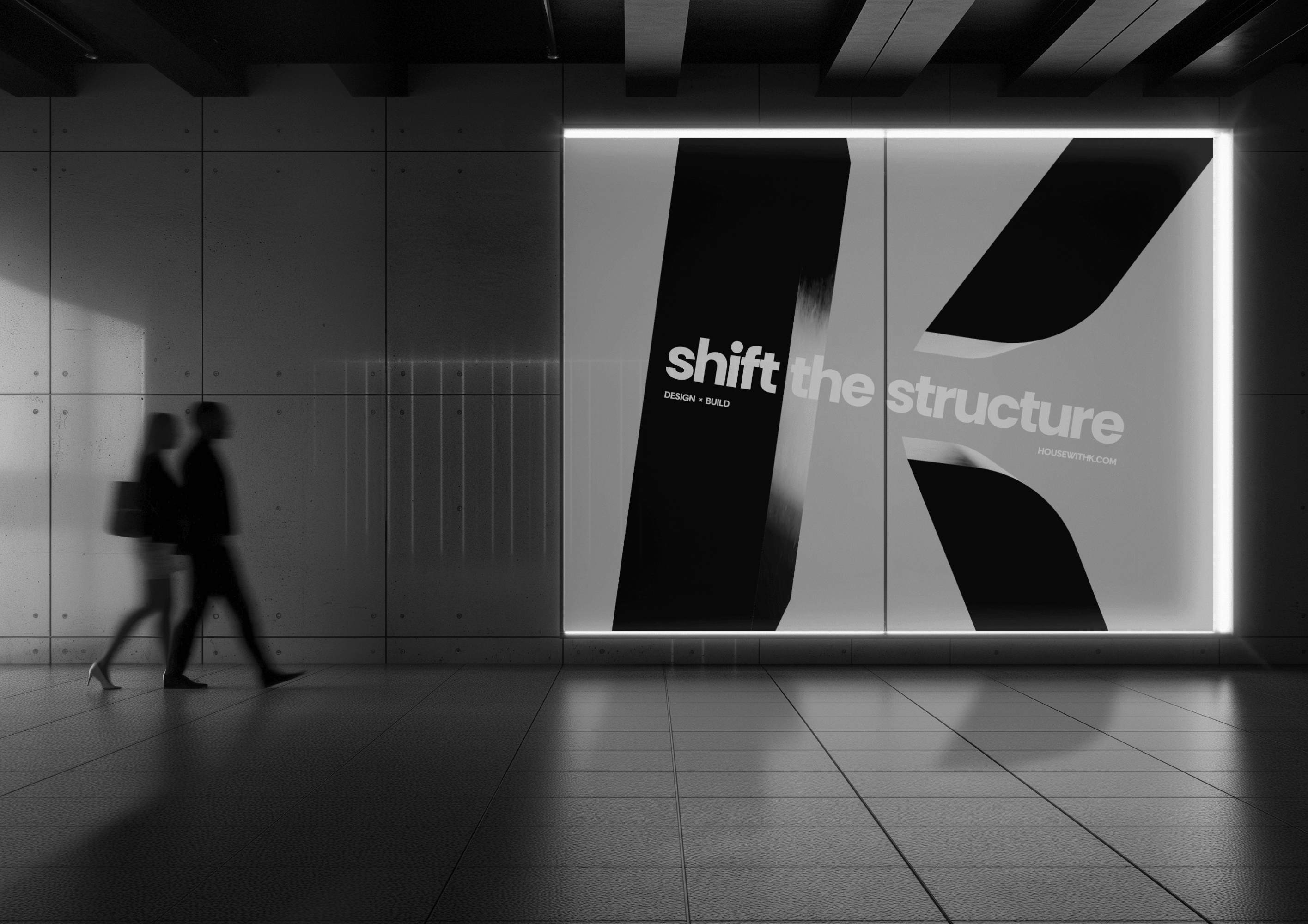
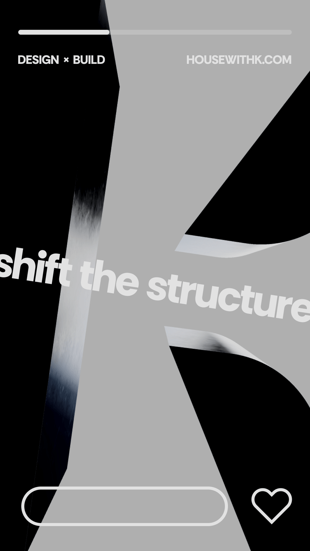
shift
the structure
shift
the structure
shift
the structure
Adopting alternative perspectives within
structure to define the optimal solution
Adopting alternative perspectives within
structure to define the optimal solution
Stripped
to Basic
Stripped
to Basic
Stripped
to Basic
A structure stripped to its core
becomes a framework of infinite potential
A structure stripped to its core
becomes a framework of infinite potential
LOGO SYSTEM
logotype
CONSTRUCTION
logotype
CONSTRUCTION
logotype
CONSTRUCTION
logotype
CONSTRUCTION
The structure of 'House' is visualized as a grid. Each section represents a 'Room', and the curves symbolize 'Doors' that connect them. This reflects a flexible, organic work environment open to expansion.
GRID SYSTEM
GRID SYSTEM
A precise grid ensures consistent proportions and structural integrity in any environment.
A precise grid ensures consistent proportions and structural integrity in any environment.
type A
type A
Optimized for expansive formats such as wide desktops, large-scale posters, and out-of-home (OOH) media. The wide kerning conveys a bold and open visual presence.
Optimized for expansive formats such as wide desktops, large-scale posters, and out-of-home (OOH) media. The wide kerning conveys a bold and open visual presence.
Optimized for expansive formats such as wide desktops, large-scale posters, and out-of-home (OOH) media. The wide kerning conveys a bold and open visual presence.
DESKTOP
DESKTOP
BAG
OOH MEDIA
OOH MEDIA
type A
type A
type B
type B
Designed for layouts with restricted vertical space, such as mobile screens, vertical banners, and business cards. By scaling up the lower text, it maintains a solid visual weight within a confined area.
Designed for layouts with restricted vertical space, such as mobile screens, vertical banners, and business cards. By scaling up the lower text, it maintains a solid visual weight within a confined area.
Designed for layouts with restricted vertical space, such as mobile screens, vertical banners, and business cards. By scaling up the lower text, it maintains a solid visual weight within a confined area.
BUSINESS CARD
BUSINESS CARD
BOOK COVER
BOOK COVER
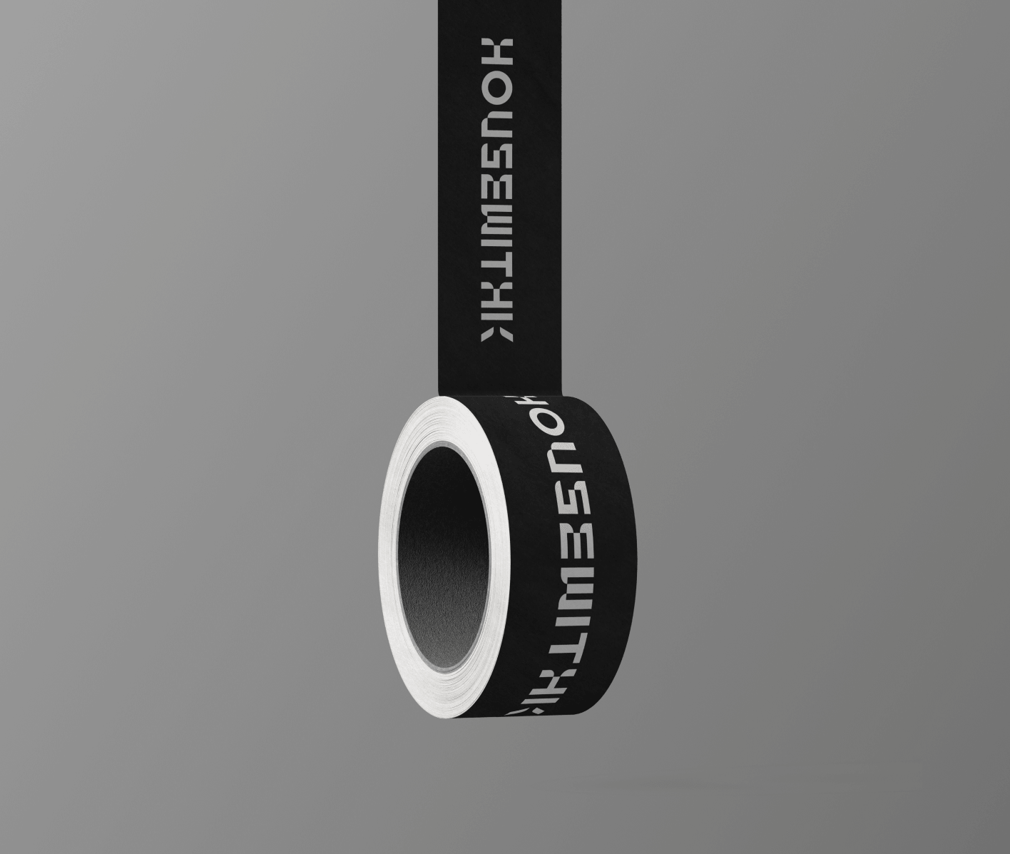
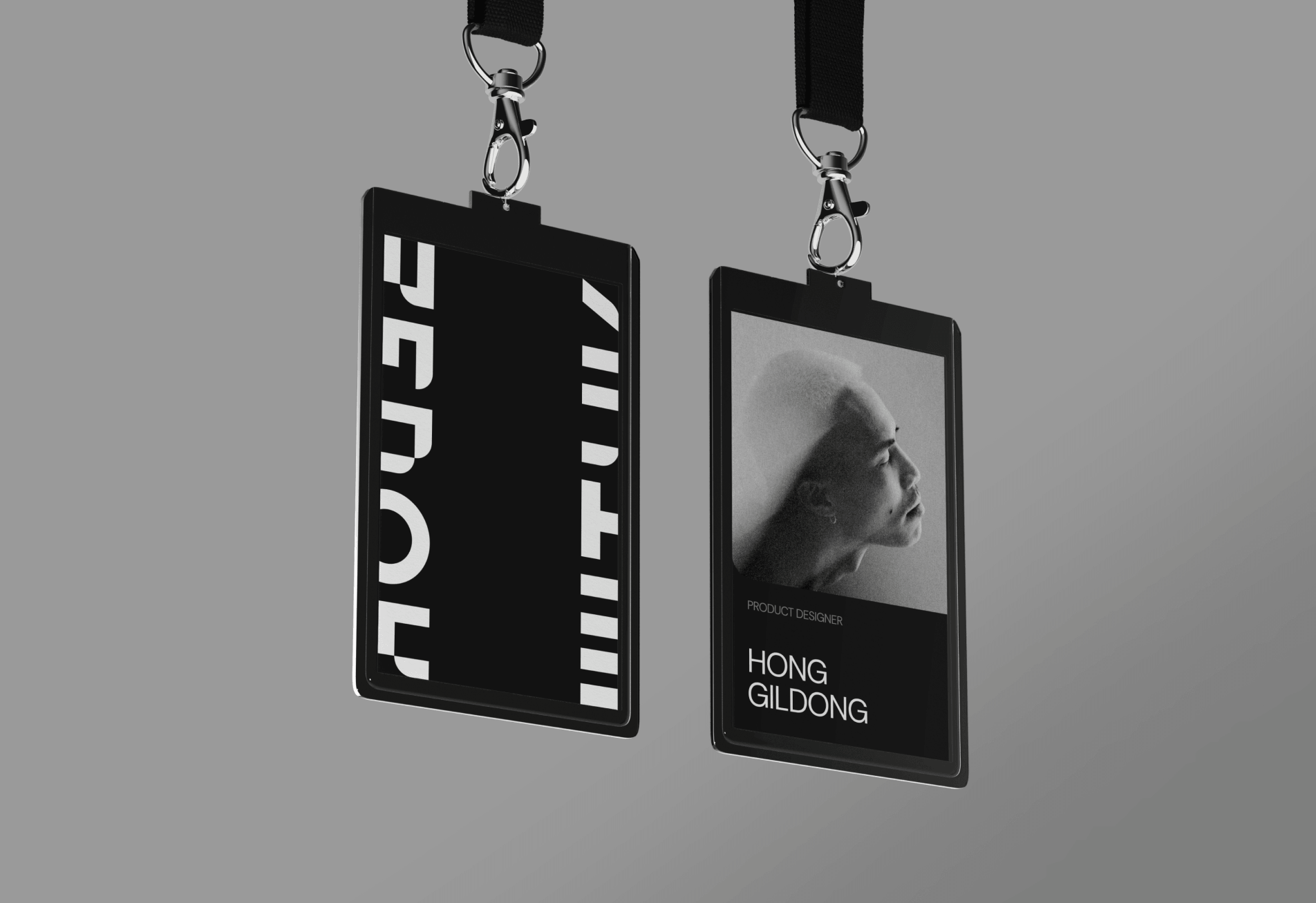
LANYARD
LANYARD
BANNER
BANNER
type B
type B
type C & D
type C & D
C TYPE
C TYPE
A wordmark visualizing the combination of 'HOW' and 'K' through wordplay. With precise kerning and horizontal compression, it ensures visual stability in narrow spaces like web headers and package sides.
A wordmark visualizing the combination of 'HOW' and 'K' through wordplay. With precise kerning and horizontal compression, it ensures visual stability in narrow spaces like web headers and package sides.
A wordmark visualizing the combination of 'HOW' and 'K' through wordplay. With precise kerning and horizontal compression, it ensures visual stability in narrow spaces like web headers and package sides.
WEB HEADER
WEB HEADER
FOOTER LOGO
FOOTER LOGO
type C
D TYPE
D TYPE
A symbolic mark representing 'K', the core of the brand. It ensures brand recognition in micro-scale formats, from favicons and app icons to product engraving and small print.
A symbolic mark representing 'K', the core of the brand. It ensures brand recognition in micro-scale formats, from favicons and app icons to product engraving and small print.
A symbolic mark representing 'K', the core of the brand. It ensures brand recognition in micro-scale formats, from favicons and app icons to product engraving and small print.
FAVICON
FAVICON
APP ICON
APP ICON
PROFILE LOGO
PROFILE LOGO
type C
type C
type D
type D
#FFFFFF
#FFFFFF
#000000
#000000
#C8C8C8
#C8C8C8
COLOR
COLOR
This palette utilizes a timeless contrast of black and white to embody the brand's commitment to sustainable value. The stark tonal difference ensures unwavering credibility and a sophisticated visual weight across both digital and physical mediums.
This palette utilizes a timeless contrast of black and white to embody the brand's commitment to sustainable value. The stark tonal difference ensures unwavering credibility and a sophisticated visual weight across both digital and physical mediums.
TYPOGRAPHY
TYPOGRAPHY
We have selected typefaces that harmonize digital flexibility with structural aesthetics. Both English and Korean fonts provide a seamless and consistent brand experience across all touchpoints.
We have selected typefaces that harmonize digital flexibility with structural aesthetics. Both English and Korean fonts provide a seamless and consistent brand experience across all touchpoints.
RETHINK SANS
RETHINK SANS
RETHINK SANS
english
english
Featuring a geometric structure and exceptional formal beauty, this typeface projects the brand's experimental identity into the digital realm. Optimized for variable font technology, it adapts fluidly to interactive and responsive environments.
Featuring a geometric structure and exceptional formal beauty, this typeface projects the brand's experimental identity into the digital realm. Optimized for variable font technology, it adapts fluidly to interactive and responsive environments.
Featuring a geometric structure and exceptional formal beauty, this typeface projects the brand's experimental identity into the digital realm. Optimized for variable font technology, it adapts fluidly to interactive and responsive environments.
REGULAR
REGULAR
EXTRA BOLD
PRETENDARD
PRETENDARD
PRETENDARD
한글
한글
A Korean typeface proven for its superior readability and versatility. It ensures consistent rendering from low to high resolutions and shares a cohesive visual tone with Rethink Sans.
A Korean typeface proven for its superior readability and versatility. It ensures consistent rendering from low to high resolutions and shares a cohesive visual tone with Rethink Sans.
A Korean typeface proven for its superior readability and versatility. It ensures consistent rendering from low to high resolutions and shares a cohesive visual tone with Rethink Sans.
400
400
DESIGNER'S NOTE
DESIGNER'S NOTE
Visual Synergy
Visual Synergy
Both Rethink Sans and Pretendard are curated to share a underlying geometric framework. This maintains a balanced typographic hierarchy without visual disparity, even in multi-language layouts.
Both Rethink Sans and Pretendard are curated to share a underlying geometric framework. This maintains a balanced typographic hierarchy without visual disparity, even in multi-language layouts.
Web Performance
Web Performance
All fonts are deployed in WOFF2 format. By maximizing page load speeds while preserving high-quality rendering, we achieve both aesthetic excellence and technical integrity.
All fonts are deployed in WOFF2 format. By maximizing page load speeds while preserving high-quality rendering, we achieve both aesthetic excellence and technical integrity.
DESIGNER'S NOTE
Visual Synergy
Both Rethink Sans and Pretendard are curated to share a underlying geometric framework. This maintains a balanced typographic hierarchy without visual disparity, even in multi-language layouts.
Web Performance
All fonts are deployed in WOFF2 format. By maximizing page load speeds while preserving high-quality rendering, we achieve both aesthetic excellence and technical integrity.
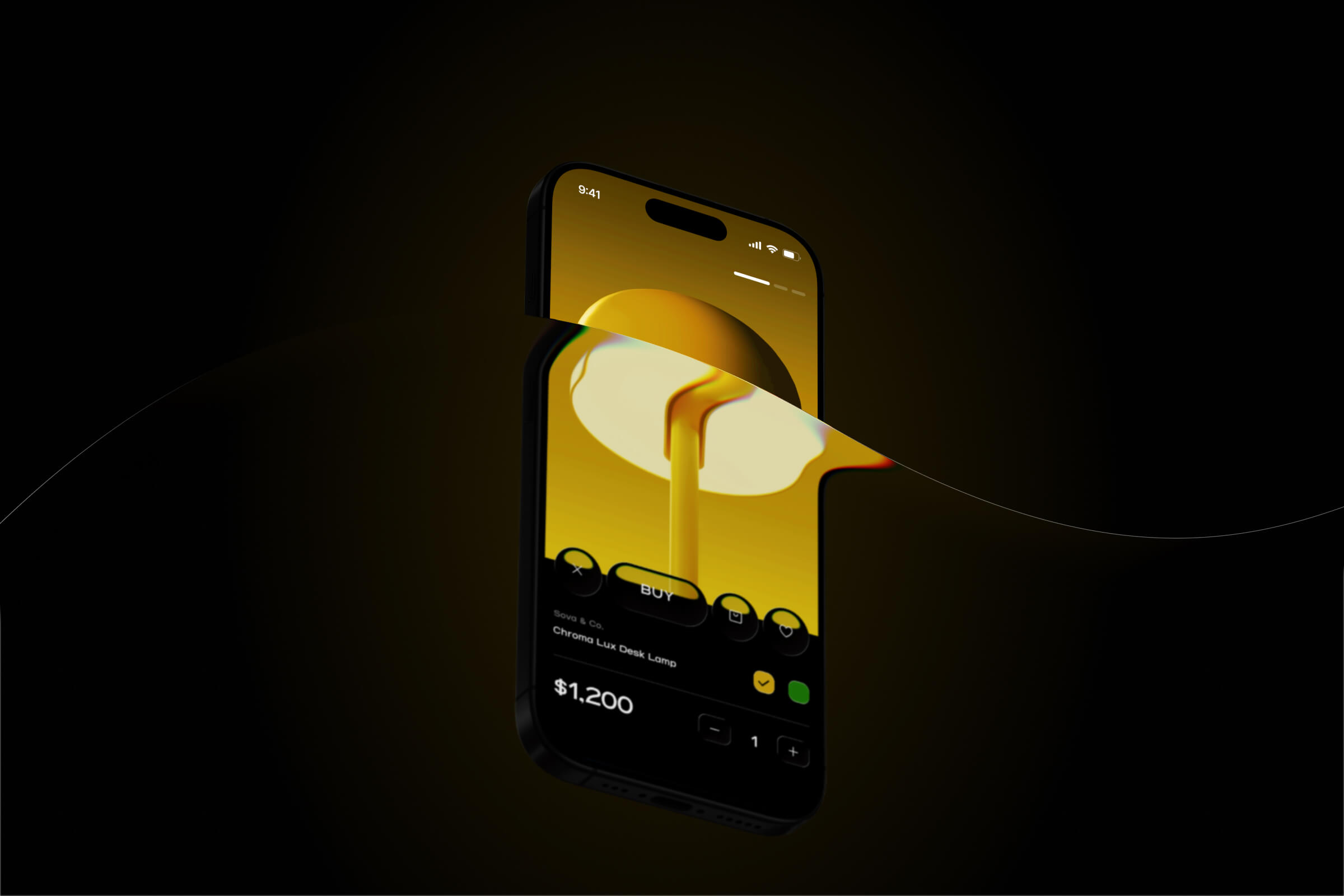
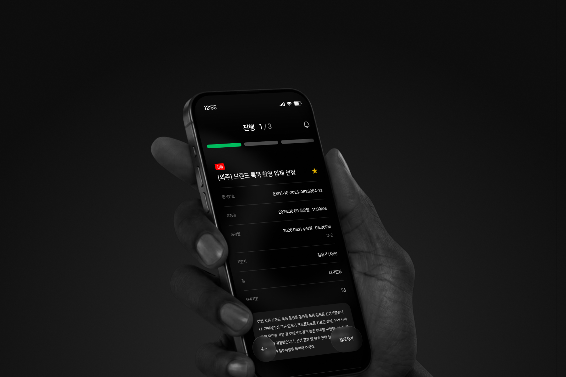
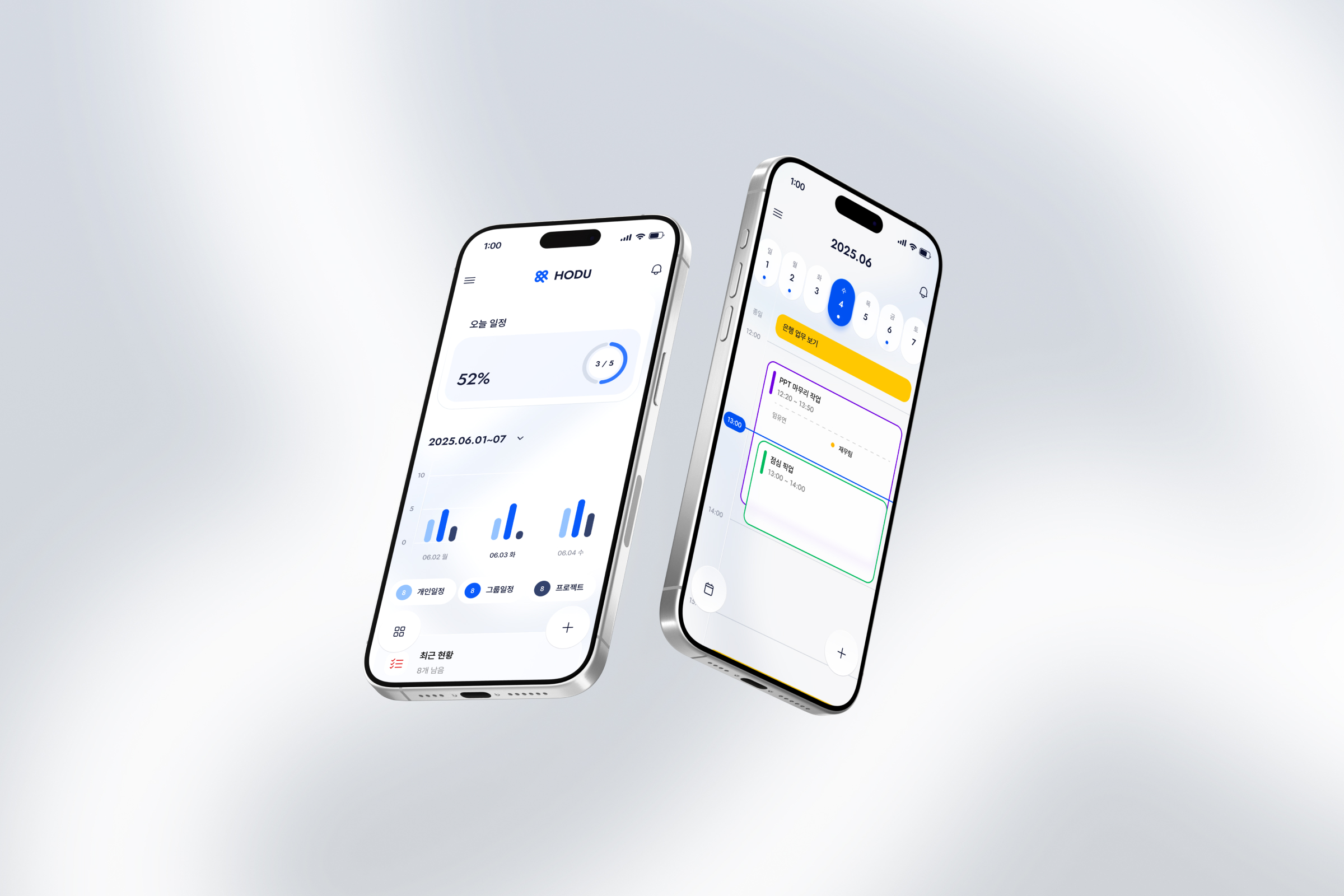
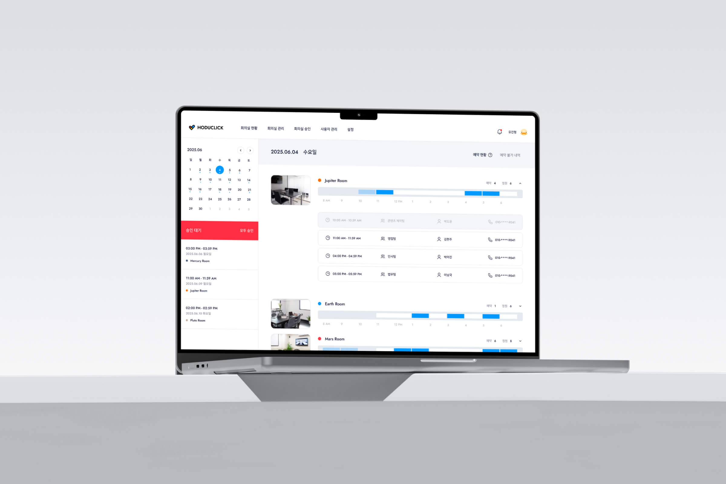
APPLICATION
open vision ROOM
The structure remains constant while the forms expand.
APPLICATION
open vision ROOM
The structure remains constant while the forms expand.
APPLICATION
OPEN VISION ROOM
구조는 유지되고, 형태는 확장됩니다.
The structure remains constant while the forms expand.
STATIONERY
STATIONERY
BUSINESS CARD
DUCTTAPE
LAYNARD
LETTERHEAD
Business Card
ducT tape
Lanyard
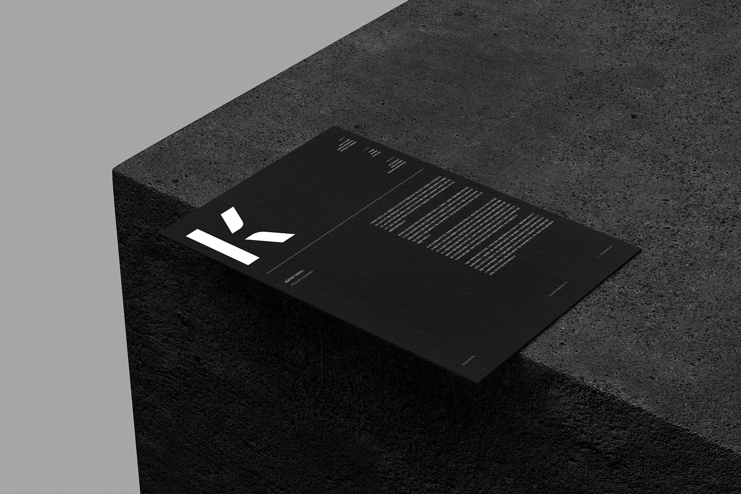
LETTERHEAD
ADVERTISING
ADVERTISING
POSTER
SNS
OOH MEDIA
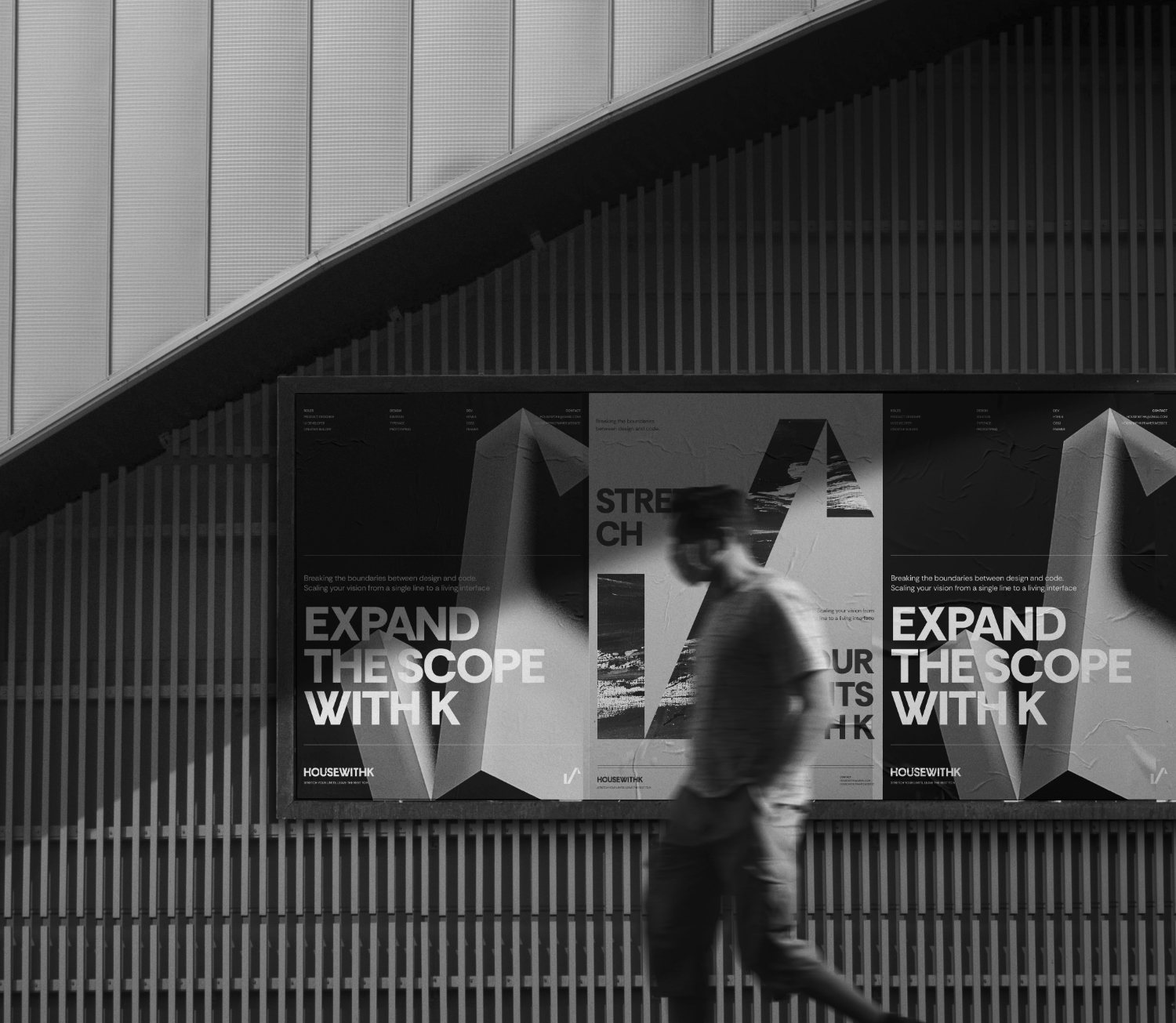
POSTER
sns
OOH
[00]
[01]
[02]
[END]