호두앱 - HODU APP

BASIC
TOOLS
Figma
Figma
Photoshop
Photoshop
Illustrator
Illustrator
Affinity
Designer
Affinity
Designer
Affinity
Photo
Affinity
Photo
2018-21
CALENDAR APP · WEB
DESIGN (100%)
HTML/CSS/JS (100%)
PLANNING (80%)
HODU SERIES
HODU SERIES
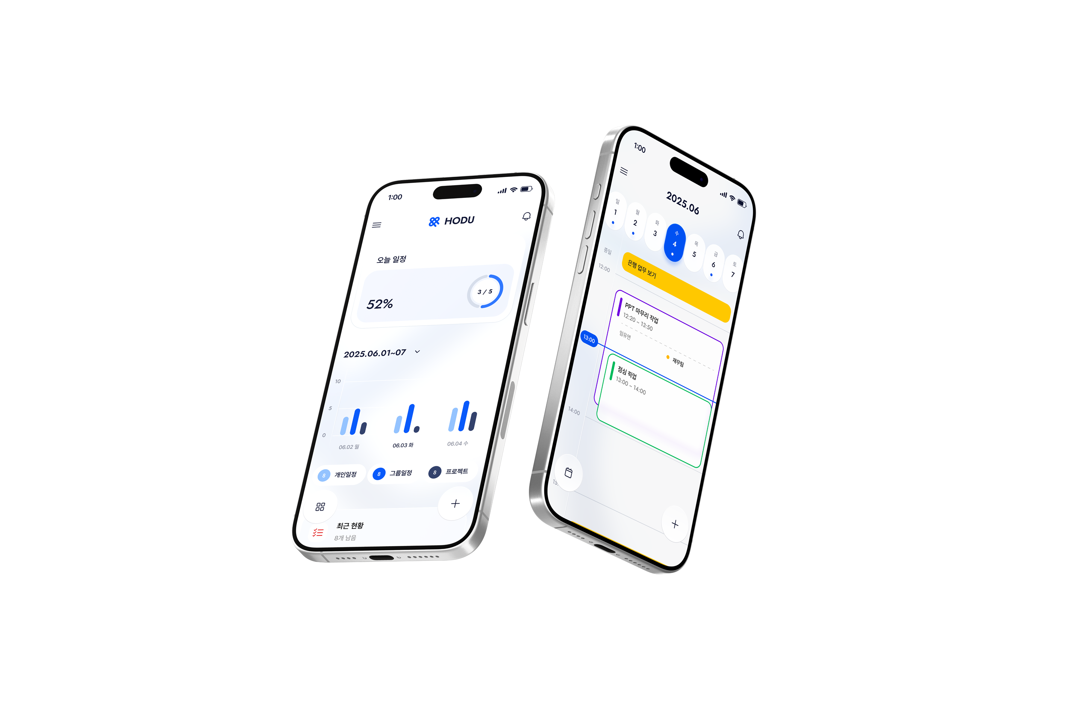
An all-in-one schedule management system to control the daily flow in one place. Centering on the calendar, users can manage personal and group schedules, chats, and files in real-time. It includes premium features like medical bookings and visitor management for a wide range of use
An all-in-one schedule management system to control the daily flow in one place. Centering on the calendar, users can manage personal and group schedules, chats, and files in real-time.
It includes premium features like medical bookings and visitor management for a wide range of use.
DAILY MANAGEMENT
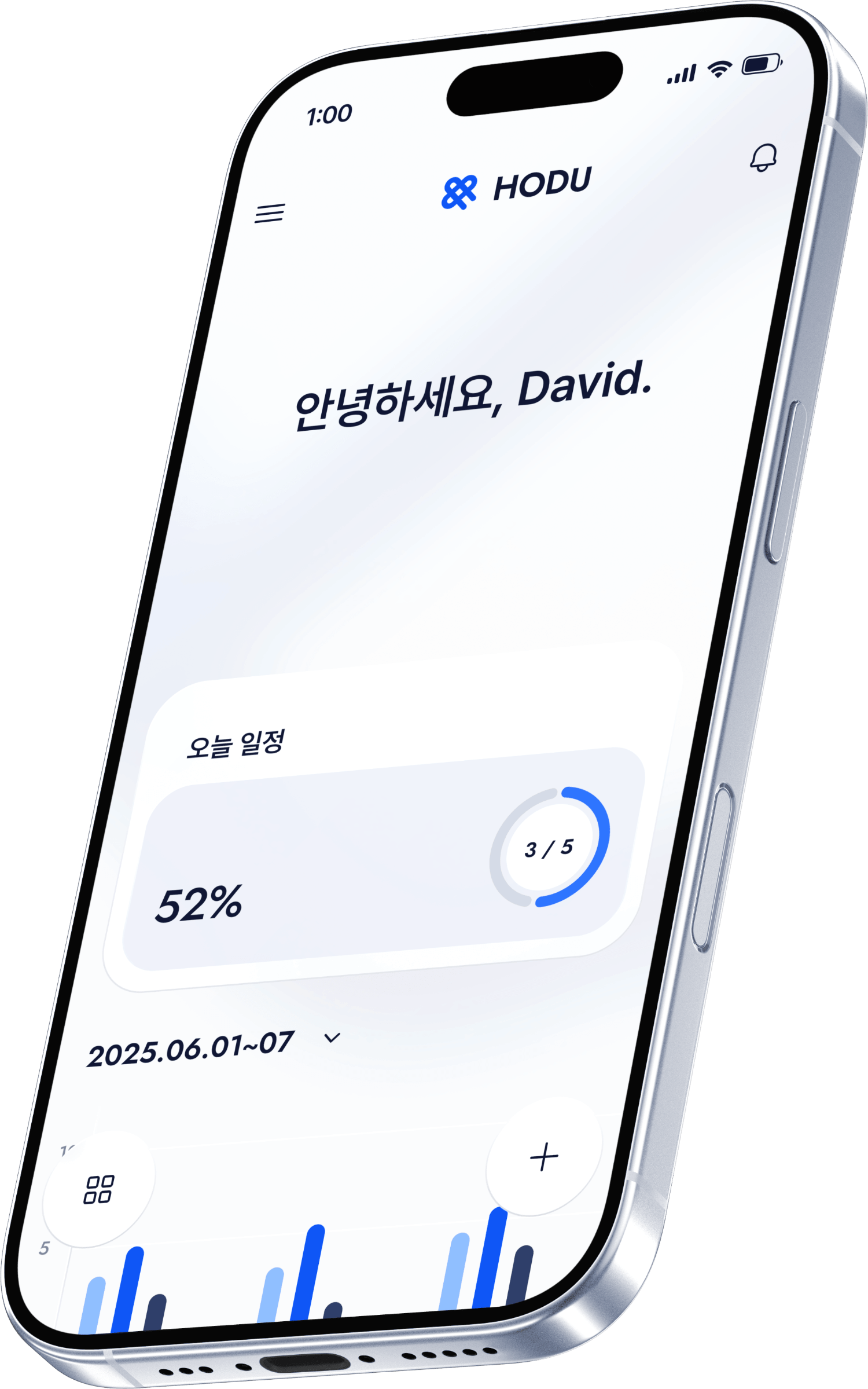
HODU APP
DAILY MANAGEMENT
HODU APP
DAILY MANAGEMENT
HODU APP
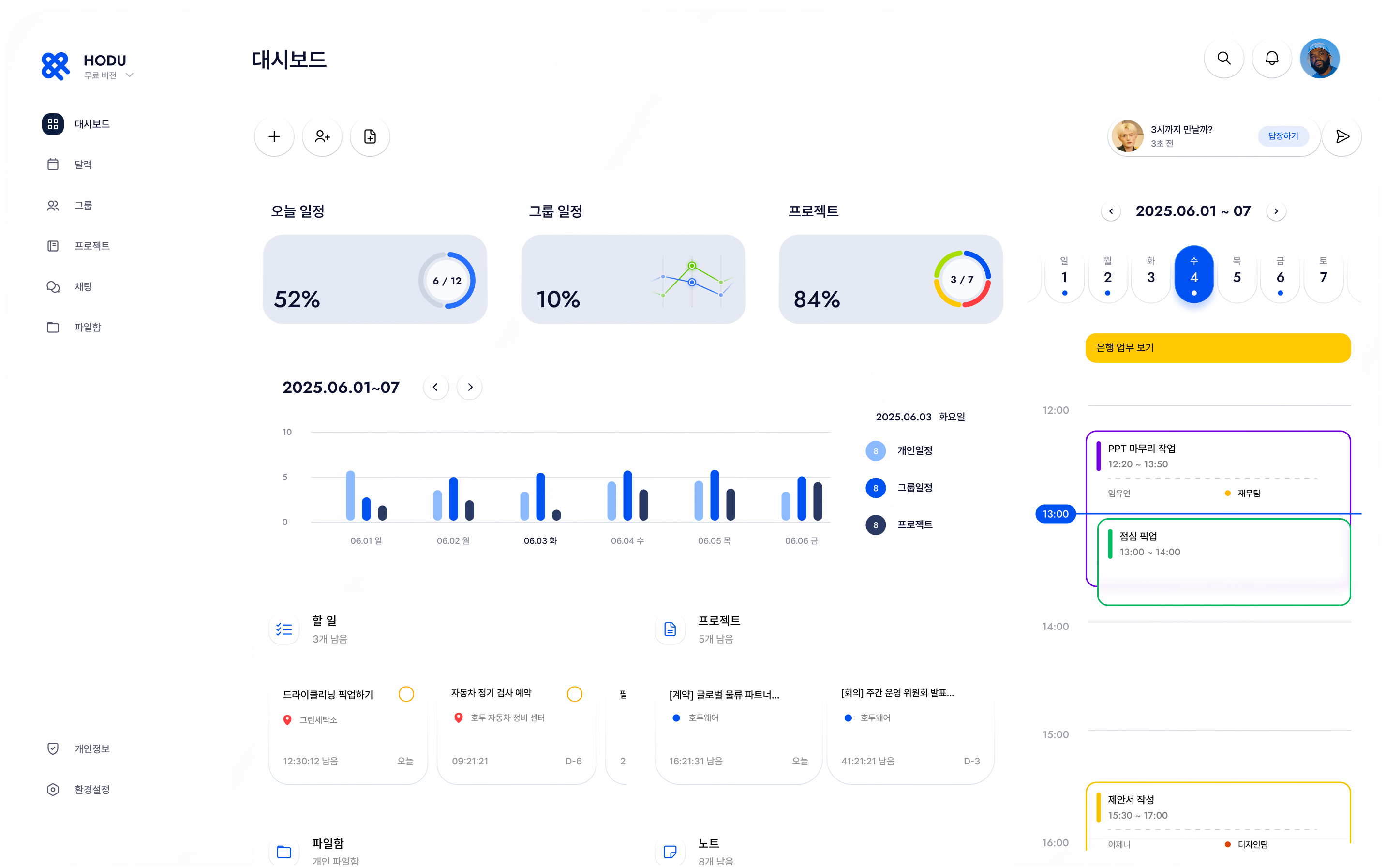
I integrated new features into a single context
to ensure a seamless flow across all functions
I integrated new features into a single context to ensure a seamless flow across all functions.
I integrated new features into a single context
to ensure a seamless flow across all functions
I integrated new features into a single context
to ensure a seamless flow across all functions
1
1
PROBLEM
PROBLEM
1
PROBLEM
Structural Complexity
& User Confusion
Structural Complexity
& User Confusion
Structural Complexity
& User Confusion
Fragmented hierarchy and feature bloat led to information overload and user confusion
Fragmented hierarchy and feature bloat led to information overload and user confusion
Difficulty navigating due to
overly integrated features
Inconsistency
Overload
Delays
WORKS
GROUP
BASIC
DOC
GROUP
HOME
WORKS
GROUP
BASIC
Difficulty navigating due to
overly integrated features
Inconsistency
Overload
Delays
WORKS
GROUP
BASIC
DOC
GROUP
HOME
WORKS
GROUP
BASIC
Unintuitive distinction between
Basic and Premium features
Blurred
Confusion
Low Awareness
BASIC
PREMIUM
BASIC
Unintuitive distinction between
Basic and Premium features
Blurred
Confusion
Low Awareness
BASIC
PREMIUM
BASIC
Users losing track of their flow
when switching between features
System Inconsistency
Friction
Indecision
Users losing track of their flow
when switching between features
System Inconsistency
Friction
Indecision
2
2
SOLUTION
SOLUTION
2
SOLUTION
Simplified Experience through Connection
Simplified Experience through Connection
Simplified Experience through Connection
A seamless, single-flow architecture integrates all features into one context, ensuring clarity and future scalability
A seamless, single-flow architecture integrates all features into one context, ensuring clarity and future scalability

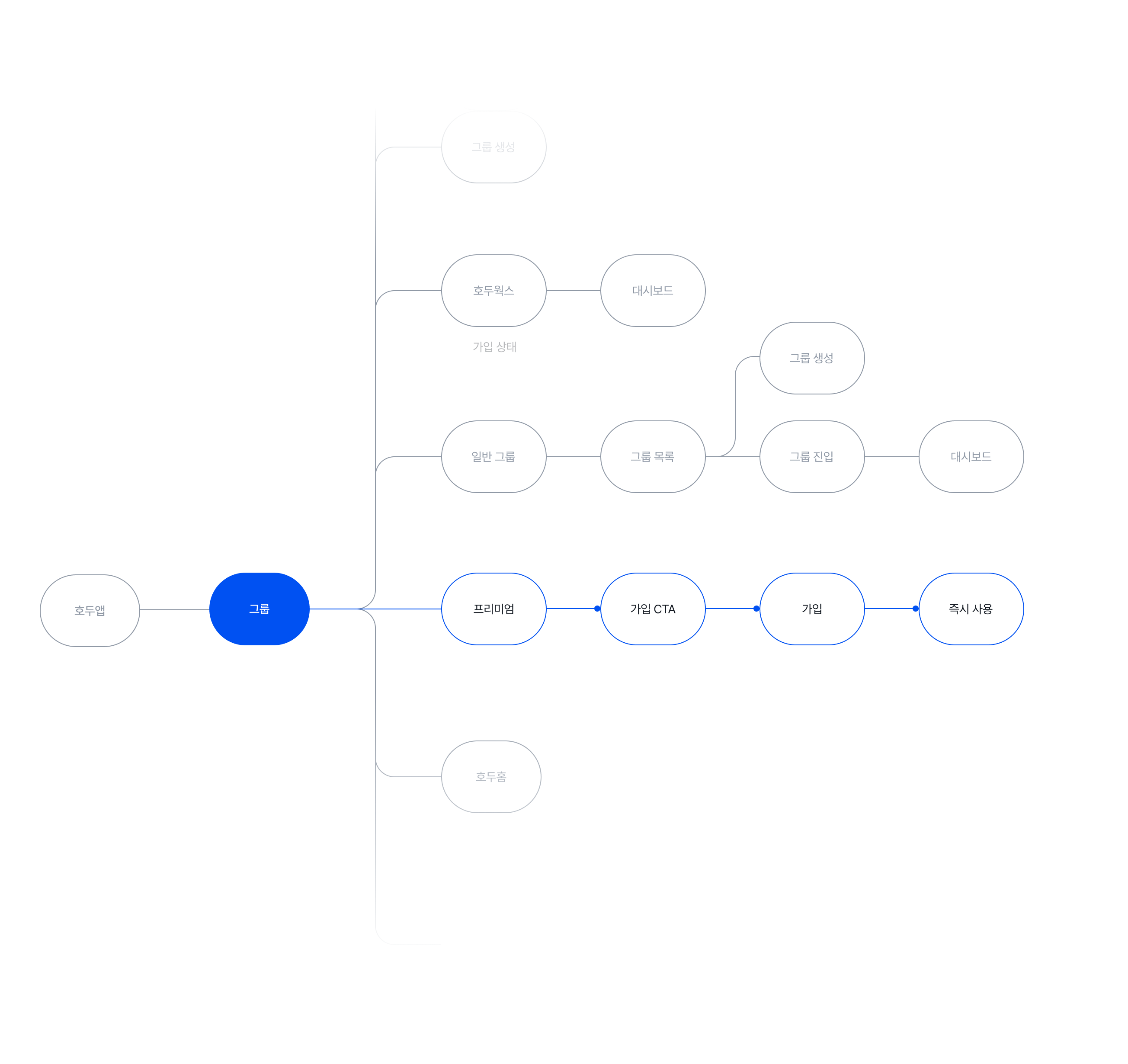
Solution A
Solution A
Contextual Entry
Contextual Entry
Group Interface
Swipe Entry
Contextual Link
Group Interface
Swipe Entry
Contextual Link
Designing Entry Points Based on Context
Designing Entry Points
Based on Context
I integrated premium features directly into daily group lists via swipe interactions. This eliminates complex navigation layers, allowing users to switch between services instantly without losing context
I integrated premium features directly into daily group lists via swipe interactions. This eliminates complex navigation layers, allowing users to switch between services instantly without losing context
I integrated premium features directly into daily group lists via swipe interactions. This eliminates complex navigation layers, allowing users to switch between services instantly without losing context
Solution B
Solution B
Consistency Across Services
Consistency Across Services
Unified Dashboard
Seamless Flow
Design Consistency
Unified Dashboard
Seamless Flow
Design Consistency
Maintaining Consistency in Experience
Maintaining Consistency
in Experience
Despite varying service types, I maintained a consistent core layout and hierarchy. This ensures a stable brand experience and intuitive navigation, regardless of the feature being used
Despite varying service types, I maintained a consistent core layout and hierarchy. This ensures a stable brand experience and intuitive navigation, regardless of the feature being used
Despite varying service types, I maintained a consistent core layout and hierarchy. This ensures a stable brand experience and intuitive navigation, regardless of the feature being used
HODU
Core Platform
HODU
DOC
Medical Health
HODU
HOME
Living & Space
HODU
NEXT
+ New Version
Solution C
Solution C
Scalable Design System
Scalable Design System
Color Identity
Work Efficiency
Scalability
Color Identity
Work Efficiency
Scalability
Building a Sustainable System
Building a Sustainable System
I established a universal design standard with optimized color systems for visual distinction. This scalable framework streamlines the end-to-end process from planning to future premium launches
I established a universal design standard with optimized color systems for visual distinction. This scalable framework streamlines the end-to-end process from planning to future premium launches
I established a universal design standard with optimized color systems for visual distinction. This scalable framework streamlines the end-to-end process from planning to future premium launches
3
3
USERFLOW
USERFLOW
3
USERFLOW
Premium Version
User Flow
Premium Version
User Flow
Premium Version
User Flow
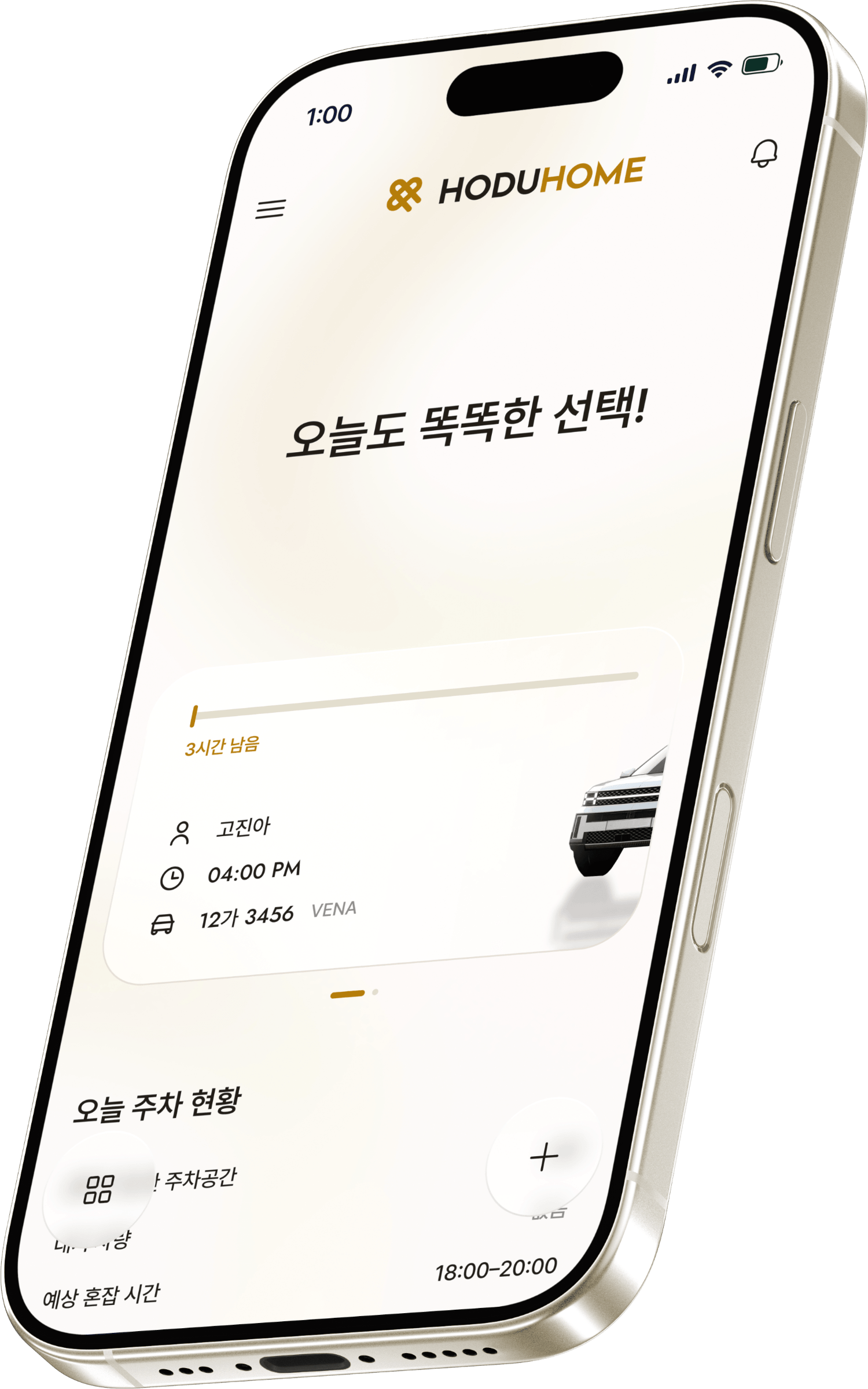
I designed a unified flow that leads naturally from selection to subscription on a single screen. This ensures an immediate transition to premium features without any unnecessary steps
I designed a unified flow that leads naturally from selection to subscription on a single screen. This ensures an immediate transition to premium features without any unnecessary steps

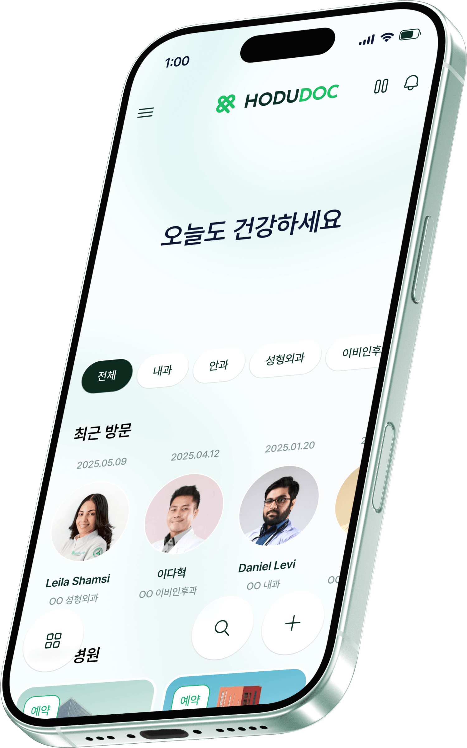
HODU

HODUDOC

HODUHOME
4
4
MASCOT
MASCOT
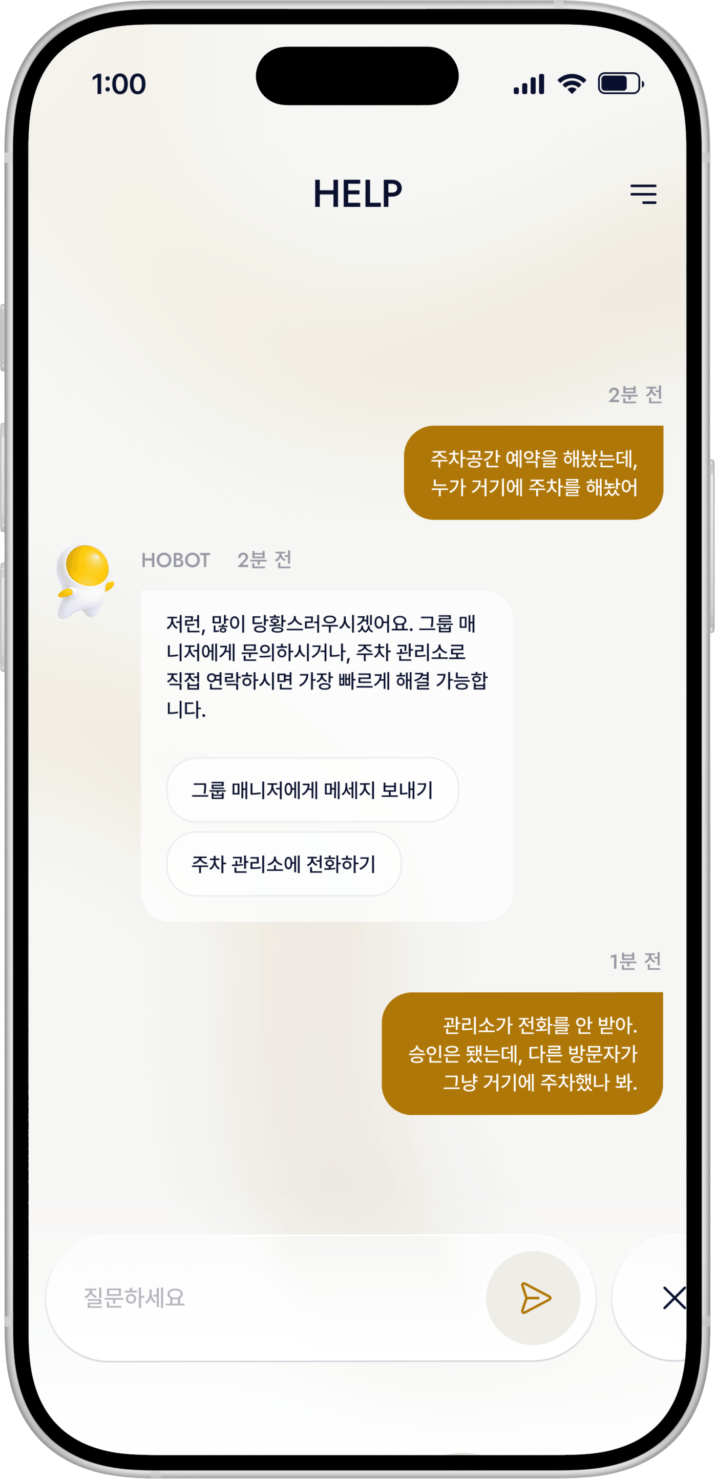
HOBOT
HOBOT is the lead character designed to bridge the gap between the service and the user. By applying series-specific colors to a friendly aesthetic, I ensured the character enhances brand rapport while helping users distinguish between different products
4
4
MASCOT
MASCOT
4
MASCOT
HOBOT
HOBOT
HOBOT
HOBOT은 호두 시리즈의 세계관을 이끄는 대표 캐릭터로, 브랜드 경험의 중심에서 사용자와 상호작용하는 핵심 캐릭터입니다. 챗봇이라는 기능적 역할을 기반으로, 사용자에게 심리적 안정감과 친근함을 제공하는 데 중점을 두었으며, 동시에 자연스럽게 호감을 형성할 수 있는 귀여운 비주얼로 설계되었습니다.
또한 시리즈별로 포인트 컬러를 적용하여 각 제품 및 콘텐츠를 직관적으로 구분할 수 있도록 했으며, 부드럽고 이질감 없는 디자인 언어를 통해 다양한 사용자층에게 편안하게 다가갈 수 있는 브랜드 상징성을 강화했습니다.
HOBOT is the lead character of the Hodu series, enhancing the brand experience through user interaction. I designed it with a friendly, cute aesthetic to build rapport as a chatbot. By using consistent design and series-specific point colors, I ensured the character remains approachable and helps distinguish between different products.
HOBOT is the lead character of the Hodu series, enhancing the brand experience through user interaction. I designed it with a friendly, cute aesthetic to build rapport as a chatbot. By using consistent design and series-specific point colors, I ensured the character remains approachable and helps distinguish between different products.
HODU
HODUDOC
HODUDOC
5
5
VISUAL IDENTITY
VISUAL IDENTITY
Unified Visual System
Unified Visual System
I established a cohesive visual identity for the Hodu series. The defined typography and color system ensure brand consistency and an intuitive experience across all digital environments
5
VISUAL IDENTITY
Unified Visual System
I established a cohesive visual identity for the Hodu series. The defined typography and color system ensure brand consistency and an intuitive experience across all digital environments
Prentendard
Prentendard
Medium
Medium
Semibold
Semibold
Prentendard
Medium
Semibold
HODU
HODU
#0051F2
#0051F2
BG COLOR
BG COLOR
#FFFFFF
#FFFFFF
FONT COLOR
FONT COLOR
#11171F
#11171F
HODU
#0051F2
BG COLOR
#FFFFFF
FONT COLOR
#11171F
HODUDOC
HODUDOC
#C2BECF
#C2BECF
HODOHOME
HODOHOME
#C2BECF
#C2BECF
HODUDOC
#C2BECF
HODOHOME
#C2BECF

6
6
UI / INTERACTION
UI / INTERACTION
Selected Pages
Selected Pages
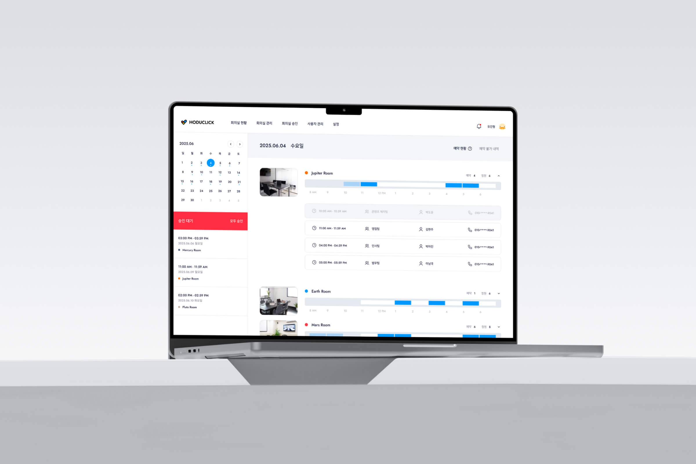
A curated selection of main screens highlighting the overall structure and functional flow. These pages demonstrate the seamless connectivity and core user experience of the service
DASHBOARD
[VIDEO]
SCHEDULE
[IMAGE]
CALENDAR
[VIDEO]
FILEBOX
[VIDEO]
WEB VERSION
[VIDEO]
GROUP
[IMAGE]
CHAT
[IMAGE]
HODUDOC
[VIDEO]
MAKE APPOINTMENT
[VIDEO]
HODUHOME
[VIDEO]
PLACE
[VIDEO]
5
UI / INTERACTION
Selected Pages
I organized the main screens in one place so that the overall structure and functional flow can be understood at a glance. You can review the overall user experience, focusing on the connectivity between pages and the flow of use.
DASHBOARD
[VIDEO]
SCHEDULE
[VIDEO]
CALENDAR
[VIDEO]
FILEBOX
[VIDEO]
WEB VERSION
[VIDEO]
GROUP
[VIDEO]
CHAT
[VIDEO]
HODUDOC
[VIDEO]
MAKE APPOINTMENT
[VIDEO]
HODUHOME
[VIDEO]
PLACE
[VIDEO]
[00]
[01]
[02]
[03]
[04]
[05]
[END]
[00]
[01]
[02]
[03]
[04]
[05]
[END]