호두클릭 - HODUCLICK
BASIC
TOOLS
Photoshop
Photoshop
Illustrator
Illustrator
Affinity
Designer
Affinity
Designer
Affinity
Photo
Affinity
Photo
2018
ROOM RESERVATION WEB · TAB
DESIGN (100%)
HTML/CSS/JS (100%)
PLANNING (60%)
HODUCLICK
HODUCLICK
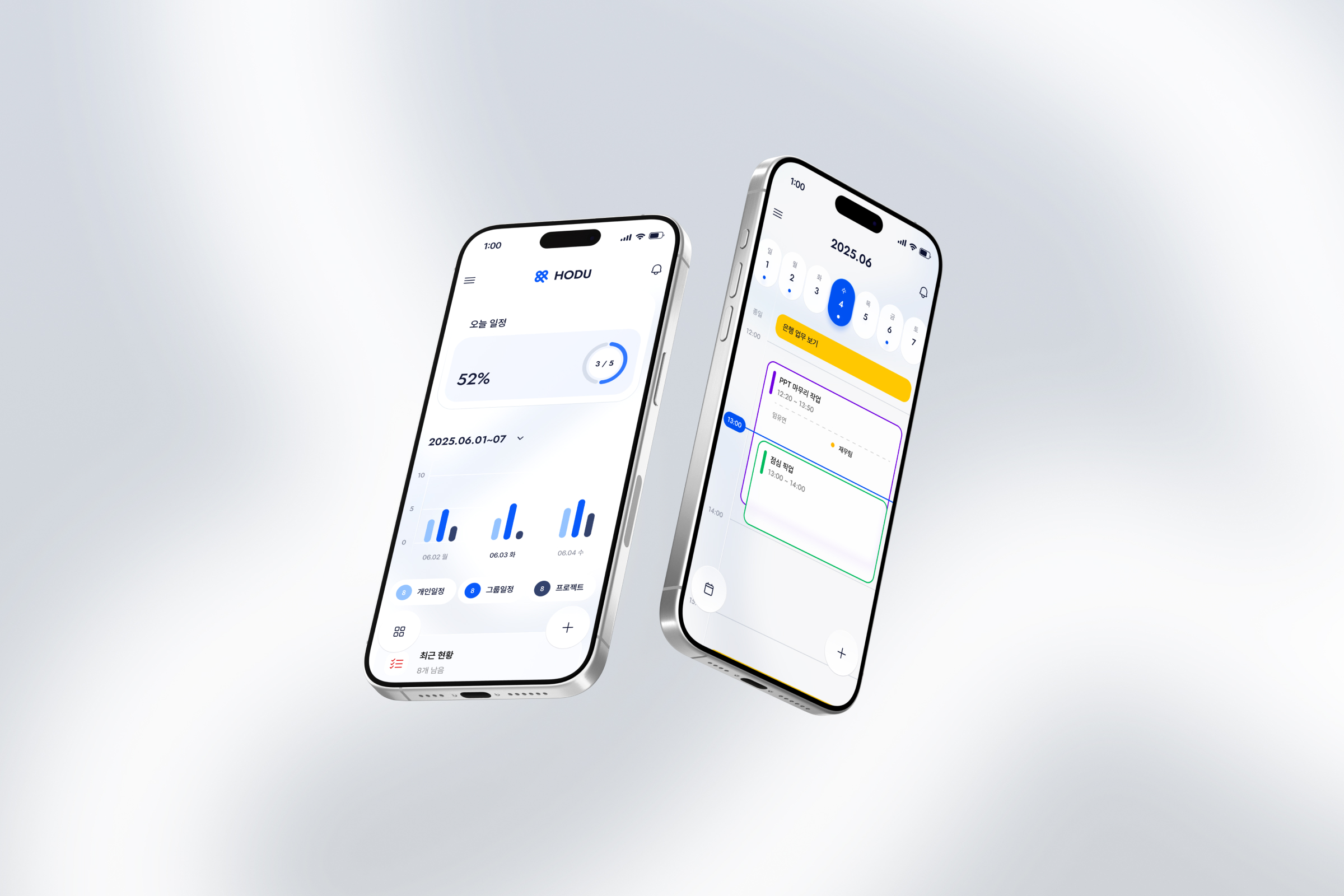
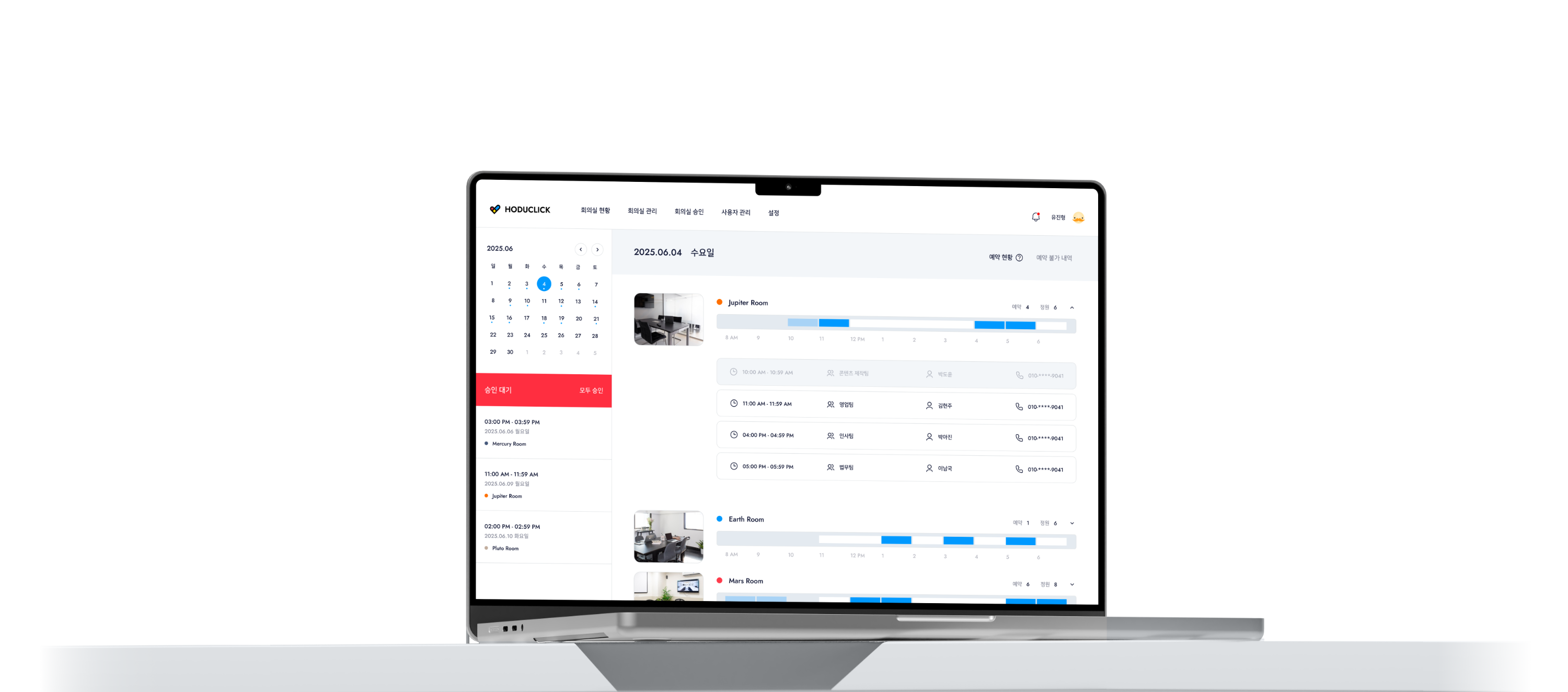
A meeting room management system for tracking reservations and usage. Designed individually for web and tablet environments, the tablet interface allows for on-site verification and immediate use. It optimizes room operations by allowing users to check status and prevent double bookings at a glance.
A meeting room management system for tracking reservations and usage. Designed individually for web and tablet environments, the tablet interface allows for on-site verification and immediate use.
It optimizes room operations by allowing users to check status and prevent double bookings at a glance.
EFFORTLESS, PRECISE SPACE
HODUCLICK
EFFORTLESS, PRECISE SPACE
HODUCLICK
EFFORTLESS, PRECISE SPACE
HODUCLICK
I created a seamless experience for both those making reservations and those managing them.
I created a seamless experience for both those making reservations and those managing them.
I created a seamless experience for both those making reservations and those managing them.
1
CONTEXT
1
CONTEXT
Mobile Booking to
Management Web
Mobile Booking to
Management Web
Mobile Booking to
Management Web
Mobile Booking to
Management Web
The mobile booking service evolved into a real-time web admin. This required a fundamental structural change to fit the administrator workflow, going beyond a simple screen expansion.
The mobile booking service evolved into a real-time web admin. This required a fundamental structural change to fit the administrator workflow, going beyond a simple screen expansion.
The mobile booking service evolved into a real-time web admin. This required a fundamental structural change to fit the administrator workflow, going beyond a simple screen expansion.
A
A
Hard to Grasp Status
at a Glance
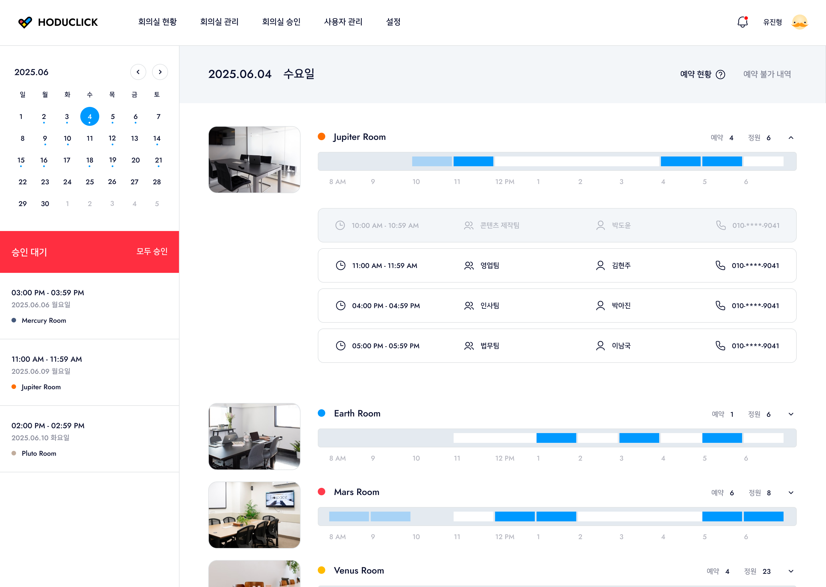
Manually checking each room's availability increases fatigue. I needed a visual structure where users could instantly see data density—identifying vacant versus fully booked rooms at once.
ROOM A
ROOM A
Reservations
7 / 9
ROOM B
ROOM B
Reservations
3 / 8
ROOM C
ROOM C
Reservations
2 / 6
A
Hard to Grasp Status
at a Glance
Manually checking each room's availability increases fatigue. I needed a visual structure where users could instantly see data density—identifying vacant versus fully booked rooms at once.
ROOM A
Reservations
7 / 9
ROOM B
Reservations
3 / 8
ROOM C
Reservations
2 / 6
CALENDAR
+
BOOK A ROOM
BOOK A ROOM
CALENDAR
+
BOOK A ROOM
BOOK A ROOM
B
B
Maintaining Uninterrupted Visual Focus
Booking is a coordination process within a timeline. To avoid the inefficiency of losing context during page transitions, I needed an environment where users never lose sight of the overall schedule.
Booking is a coordination process within a timeline. To avoid the inefficiency of losing context during page transitions, I needed an environment where users never lose sight of the overall schedule.
CALENDAR
+
BOOK A ROOM
BOOK A ROOM
B
Maintaining Uninterrupted Visual Focus
Booking is a coordination process within a timeline. To avoid the inefficiency of losing context during page transitions, I needed an environment where users never lose sight of the overall schedule.
C
C
Information to be Recognized Before Reading
On-site, a device is not something people stop to study; it is something they perceive instantly while passing by. Small text and complex information hinder that moment and disrupt the flow of space operations.
On-site, a device is not something people stop to study; it is something they perceive instantly while passing by. Small text and complex information hinder that moment and disrupt the flow of space operations.
OCCUPIED
C
Information to be Recognized Before Reading
On-site, a device is not something people stop to study; it is something they perceive instantly while passing by. Small text and complex information hinder that moment and disrupt the flow of space operations.
OCCUPIED
2
SOLUTION
2
SOLUTION
Evolving into Intuitive Design
Evolving into Intuitive Design
Evolving into
Intuitive Design
Evolving into Intuitive Design
I lowered the entry barrier for complex systems using intuitive perception and simplified flows. Timeline visualization and single screen interactions connect the process from booking to approval for a seamless experience.
I lowered the entry barrier for complex systems using intuitive perception and simplified flows. Timeline visualization and single screen interactions connect the process from booking to approval for a seamless experience.
Instant
Cognition
Instant
Cognition
Instant
Cognition
Solution A
Solution A
Reading Room Status
through the Flow of Time
Reading Room Status
through the Flow of Time
Density Visualization
Real-time Status
Intuitive Perception
Instead of comparing booking numbers, I visualized information on a timeline. By using the fill and color of the timeline bars, users can intuitively grasp the usage patterns of each space. This allows for immediate identification of vacant or soon-to-end slots, enabling efficient space allocation.
Instead of comparing booking numbers, I visualized information on a timeline. By using the fill and color of the timeline bars, users can intuitively grasp the usage patterns of each space. This allows for immediate identification of vacant or soon-to-end slots, enabling efficient space allocation.
Density Visualization
Real-time Status
Intuitive Perception
Instead of comparing booking numbers, I visualized information on a timeline. By using the fill and color of the timeline bars, users can intuitively grasp the usage patterns of each space. This allows for immediate identification of vacant or soon-to-end slots, enabling efficient space allocation.
1% - 99%
1% - 99%
0%
0%
100%
100%
Background
Background
내 예약
예약 불가
공사 중
Solution B
Solution B
Seamless Modal Booking
Seamless Modal Booking
Seamless Modal Booking
Modal Layer
Context Preservation
Operational Continuity
Modal Layer
Context Preservation
Operational Continuity
I used a modal structure to keep the timeline visible instead of switching pages. This allows viewing booking details and the full schedule at once, ensuring accurate decisions without cognitive gaps.
I used a modal structure to keep the timeline visible instead of switching pages. This allows viewing booking details and the full schedule at once, ensuring accurate decisions without cognitive gaps.
Seamless
Transition
Seamless
Transition
Seamless
Transition
Solution C
Solution C
A Status Color System
Optimized for the Field
A Status Color System
Optimized for the Field
A Status Color System
Optimized for the Field
Status-based Color
Field Optimization
Operational Flexibility
Status-based Color
Field Optimization
Operational Flexibility
To connect web admin info on site, I categorized WAITING, OCCUPIED, and AVAILABLE with distinct colors. The system also offers flexible tablet interfaces based on specific spaces and operational styles.
To connect web admin info on site, I categorized WAITING, OCCUPIED, and AVAILABLE with distinct colors. The system also offers flexible tablet interfaces based on specific spaces and operational styles.
To connect web admin info on site, I categorized WAITING, OCCUPIED, and AVAILABLE with distinct colors. The system also offers flexible tablet interfaces based on specific spaces and operational styles.
Environment
Adaptive
Environment
Adaptive
Environment
Adaptive
3
TAB VER
Tablet Design for On-site Use
Tablet Design for
On-site Use
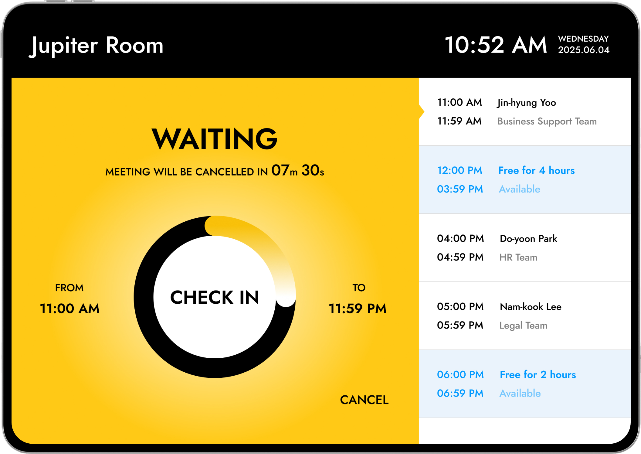
This UX flow enables quick identification and action. Colors differentiate Waiting, Occupied, and Available, while a central timer shows progress. On-screen actions like Check-in and End ensure efficient use without unnecessary navigation.
WAITING
#FFD91B
This stage prepares the room and encourages users to check in. I used a countdown to guide behavior and included an automatic cancellation feature for missed check ins to improve room turnover.

User Jin-hyeong Yu has a meeting scheduled from 11:00 to 11:59. At 10:52 AM, I guide the user to check in while in the waiting state.
User Jin-hyeong Yu has a meeting scheduled from 11:00 to 11:59. At 10:52 AM, I guide the user to check in while in the waiting state.
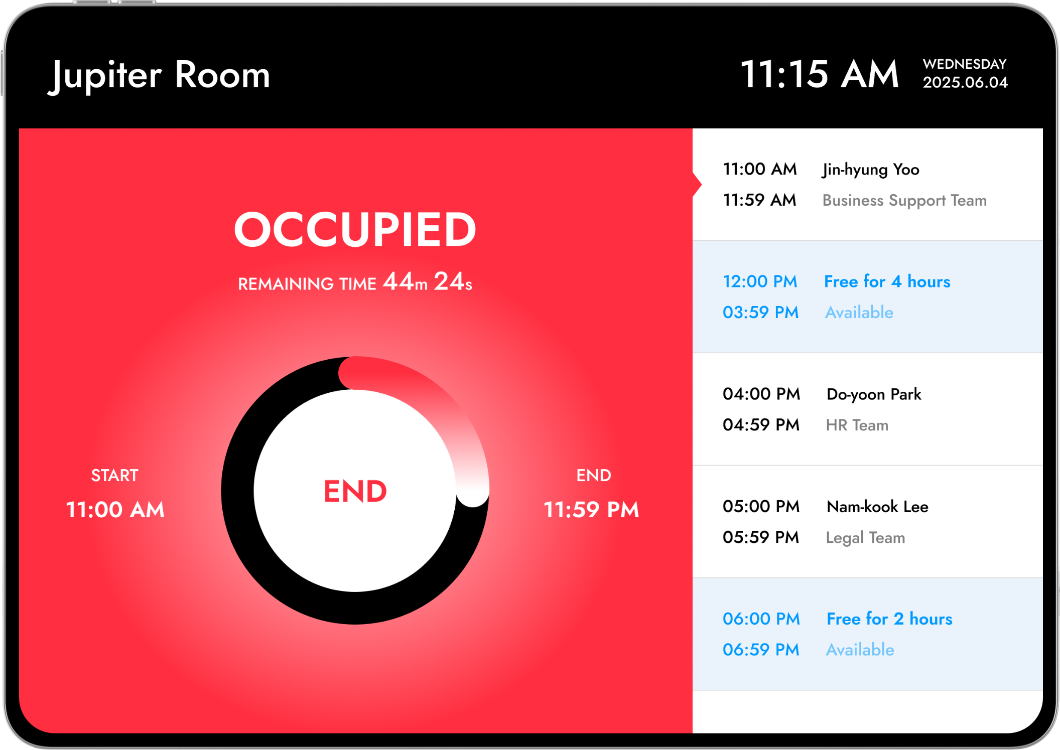
OCCUPIED
#FE2E41
For the occupied state, I clearly displayed usage and end times. A circular timer provides intuitive recognition of remaining time, while an immediate end option supports a flexible flow.
At 11:15 AM, the meeting is in progress. I can check the remaining time and end the session early if necessary.
At 11:15 AM, the meeting is in progress. I can check the remaining time and end the session early if necessary.
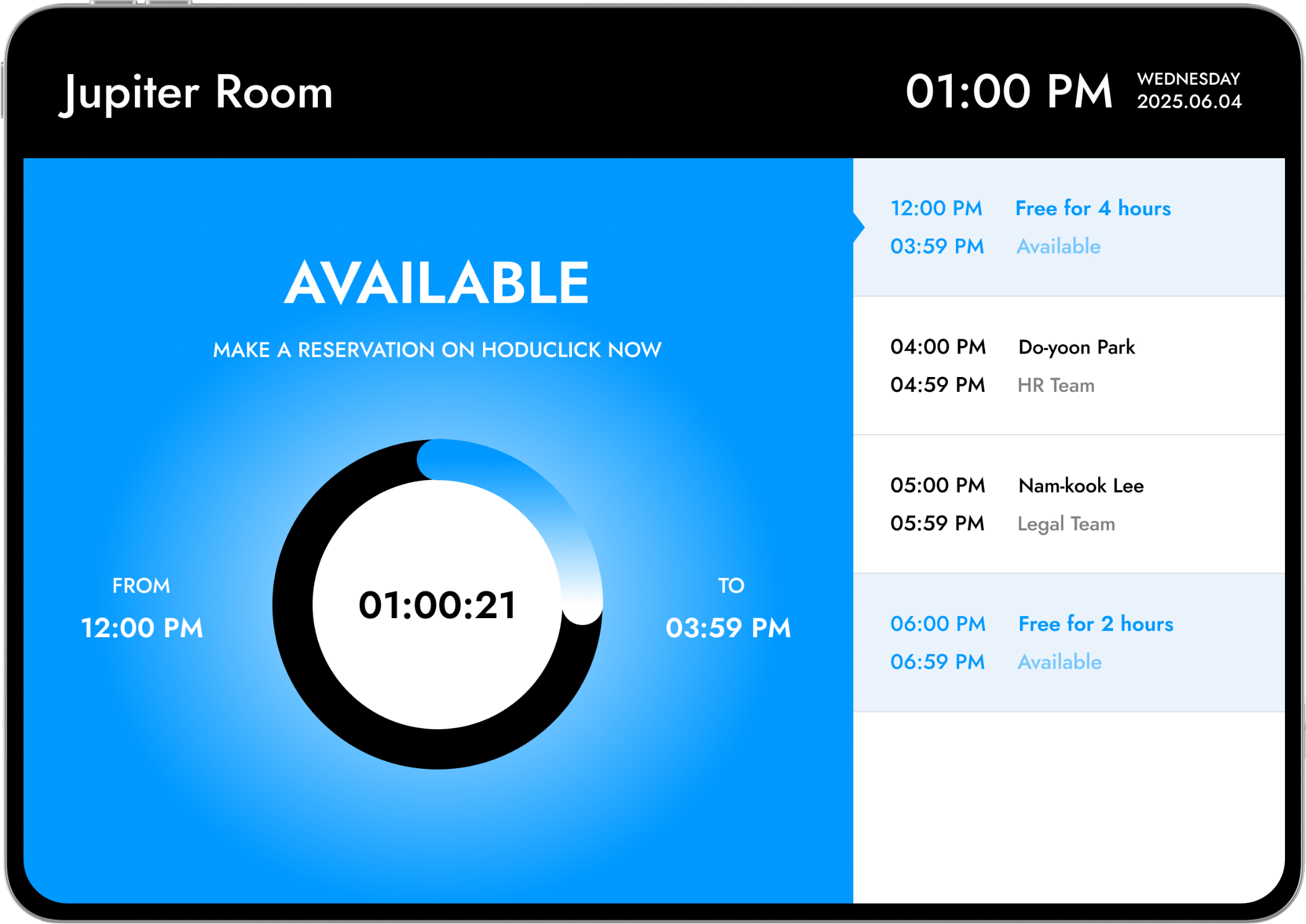
AVAILABLE
#0099FF
This stage encourages immediate reservations when the room is empty. I displayed available time until the next meeting for quick judgment and designed a seamless reservation flow.
At 01:00 PM, the meeting has ended and the room is empty. I can use the room immediately until the next scheduled reservation.
At 01:00 PM, the meeting has ended and the room is empty. I can use the room immediately until the next scheduled reservation.
3
TAB VER
3
TAB VER
현장용 탭 디자인
Tablet Design for On-site Use
Tablet Design
for On-site Use
사용자가 회의실 사용 여부를 빠르게 인지하고, 즉각적인 행동으로 이어질 수 있도록 UX 흐름에 초점을 맞춰 설계되었습니다. Waiting, Occupied, Available의 상태를 컬러로 명확하게 구분하고, 중앙의 원형 타이머를 통해 남은 시간과 진행 상황을 직관적으로 파악할 수 있도록 했습니다.
Check-in, End, Reservation과 같은 주요 액션을 화면 내에서 바로 수행할 수 있게 하여, 별도의 탐색 없이 빠른 의사결정과 효율적인 이용이 가능하도록 구성했습니다.
I designed the UX flow to help users quickly identify meeting room availability and take immediate action. I used distinct colors to clearly differentiate between Waiting, Occupied, and Available statuses, and I included a circular timer in the center so users can intuitively check the remaining time and current progress.
I also made it possible to perform key actions like Check-in, End, and Reservation directly on the screen. This setup allows for quick decision-making and efficient use without any unnecessary navigation.
WAITING
WAITING
#FFD91B
회의 시작 전 상태로, 예약된 사용자가 체크인을 진행할 수 있도록 유도하는 단계입니다. 남은 시간을 카운트다운 형태로 제공하여 사용자의 행동을 자연스럽게 유도하며, 일정 시간 내 체크인이 이루어지지 않을 경우 자동 취소되는 구조로 회의실 회전율을 고려한 UX를 반영했습니다.
This is the stage where the room is ready before a meeting starts, encouraging the scheduled user to check in. I provided the remaining time as a countdown to naturally guide user behavior. To improve room turnover, I designed the system so that the reservation is automatically canceled if the check-in is not completed within a certain timeframe.
10:52 AM, 유진형 유저의 11:00–11:59 회의가 예정되어 있으며, 대기 상태에서 Check-in을 유도합니다.
User Jin-hyeong Yu has a meeting scheduled from 11:00 to 11:59. At 10:52 AM, I guide the user to check in while in the waiting state.
OCCUPIED
OCCUPIED
#DC414E
회의가 진행 중인 상태로, 현재 사용 중인 시간과 종료 시점을 명확하게 전달하는 데 중점을 두었습니다. 남은 시간을 원형 타이머로 시각화하여 직관적으로 인지할 수 있도록 했으며, 필요 시 즉시 종료(End)가 가능하도록 하여 유연한 사용 흐름을 지원합니다.
For the occupied state, I focused on clearly communicating the current usage time and the end time. I visualized the remaining time with a circular timer for intuitive recognition and supported a flexible flow by allowing users to end the session immediately if needed.
11:15 AM, 회의가 진행 중인 상태로 남은 시간을 확인하고 필요 시 종료할 수 있습니다.
At 11:15 AM, the meeting is in progress. I can check the remaining time and end the session early if necessary.
AVAILABLE
AVAILABLE
#0099FF
회의실이 비어 있는 상태로, 사용자가 즉시 예약할 수 있도록 유도하는 단계입니다. 현재부터 다음 예약 시간까지의 여유 시간을 명확하게 보여주어 빠른 판단이 가능하도록 했으며, 즉각적인 예약 액션을 통해 사용자의 흐름이 끊기지 않도록 설계했습니다.
This stage encourages users to make an immediate reservation when the room is empty. I clearly displayed the free time available until the next scheduled meeting to help with quick judgment. I designed the immediate reservation action to ensure the user flow remains seamless.
01:00 PM, 회의 종료 후 회의실이 비어 있으며, 다음 예약 전까지 즉시 이용이 가능합니다.
At 01:00 PM, the meeting has ended and the room is empty. I can use the room immediately until the next scheduled reservation.
4
USERFLOW
Reservation Without Page Transitions
Reservation Without Page Transitions
Reservation Without Page Transitions
I streamlined the flow from availability checks to confirmation into a single screen. By eliminating page transitions, I built a seamless path where discovery and reservation management connect without interruption.
4
USERFLOW
Seamless Reservation
Structure Without
Page Transitions
I streamlined the flow from availability checks to confirmation into a single screen. By eliminating page transitions, I built a seamless path where discovery and reservation management connect without interruption.
5
UI / INTERACTION
Selected Pages
Selected Pages
Selected Pages
I organized the full screens for both web and tablet environments so they can be viewed at a glance. Through the layout and key features of each device, I can intuitively grasp the overall service flow.
I organized the full screens for both web and tablet environments so they can be viewed at a glance. Through the layout and key features of each device, I can intuitively grasp the overall service flow.
메인 & 예약 현황
DASHBOARD
[VIDEO]
회의실 관리 & 처리 모달
ROOM MANAGEMENT
[VIDEO]
AVATAR
[VIDEO]
USER MANAGEMENT & SETTINGS
[VIDEO]
TAB VERSION
[VIDEO]
5
UI / INTERACTION
Selected Pages
I organized the full screens for both web and tablet environments so they can be viewed at a glance. Through the layout and key features of each device, I can intuitively grasp the overall service flow.
DASHBOARD
[VIDEO]
ROOM MANAGEMENT
[VIDEO]
AVATAR
[VIDEO]
USER MANAGEMENT & SETTINGS
[VIDEO]
TAB DESIGN
[VIDEO]